Game Jams
This is a collection of my work from various game jams in the past year.
This is a collection of my work from various game jams in the past year.

This was for the Safe In Our World Jam. One of the key user interface elements I developed was the player's journal. I selected the fonts used in both the journal and the game. The font for the journal was chosen for its readability and for its resemblance to the player character's handwriting. The second font was picked because it complemented the first one nicely and aligned with the sweet atmosphere we aimed to create.
This was for the Safe In Our World Jam. One of the key user interface elements I developed was the player's journal. I selected the fonts used in both the journal and the game. The font for the journal was chosen for its readability and for its resemblance to the player character's handwriting. The second font was picked because it complemented the first one nicely and aligned with the sweet atmosphere we aimed to create.
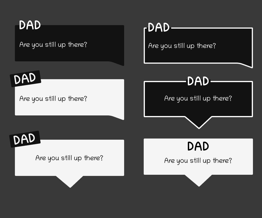
I also created several dialogue box designs, aiming for a minimalistic approach that wouldn’t distract from the characters and storyline while still being visually appealing. The final choice was a clean and minimalist style that aligned with the game's overall aesthetic, selected in collaboration with the programmer to ensure proper implementation.
I also created several dialogue box designs, aiming for a minimalistic approach that wouldn’t distract from the characters and storyline while still being visually appealing. The final choice was a clean and minimalist style that aligned with the game's overall aesthetic, selected in collaboration with the programmer to ensure proper implementation.

These designs were for the Snappy Gurus Jam. Since the game is played against an opponent, I created a progress bar at the top of the screen that is easy to understand at a glance. To indicate the recharging and loss of stamina, I opted for a yellow/grey overlay on the character. This choice was made to convey the information without overwhelming the player. The duration of a player's timeout is indicated by a mushroom timer. Initially, I planned to place this timer under the character. However, because of the number of assets located on the ground, I later decided that placing it above the character's head would be more effective.
These designs were for the Snappy Gurus Jam. Since the game is played against an opponent, I created a progress bar at the top of the screen that is easy to understand at a glance. To indicate the recharging and loss of stamina, I opted for a yellow/grey overlay on the character. This choice was made to convey the information without overwhelming the player. The duration of a player's timeout is indicated by a mushroom timer. Initially, I planned to place this timer under the character. However, because of the number of assets located on the ground, I later decided that placing it above the character's head would be more effective.

I also created a screen explaining how to play the game. As the game relied on a lot of visual cues I chose to keep this screen as visual as possible, showing the player what they could expect to see.
I also created a screen explaining how to play the game. As the game relied on a lot of visual cues I chose to keep this screen as visual as possible, showing the player what they could expect to see.
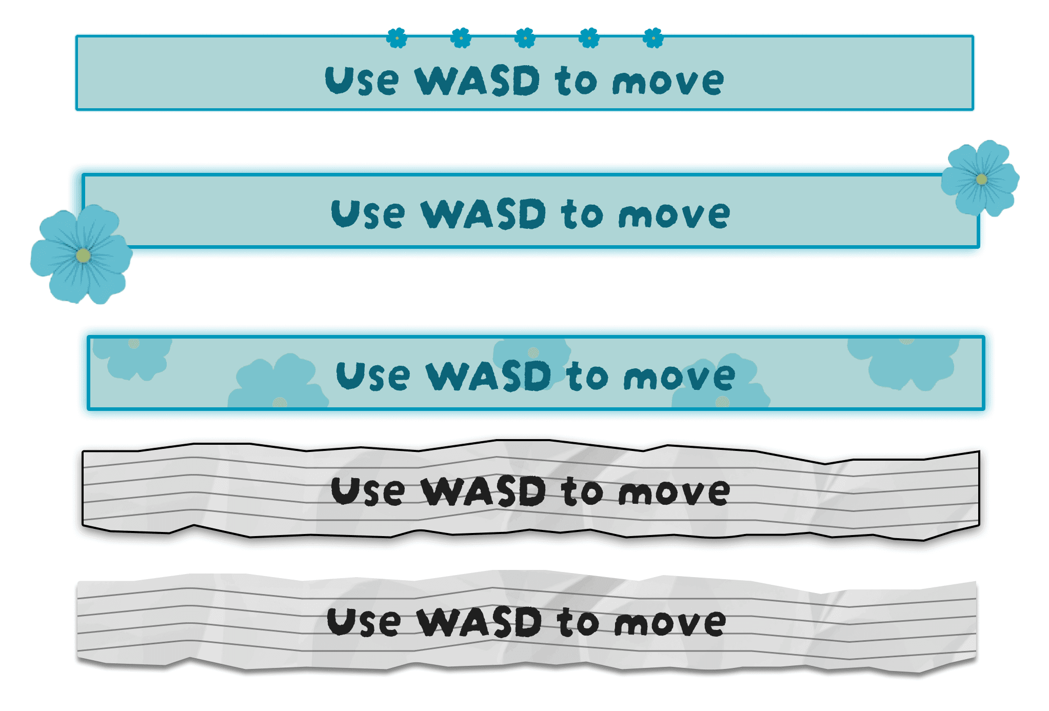
This was for the GMTK Jam. In this game we had tooltips that appeared at regular intervals to guide the player. I created a selection to try out in engine, with my final choice being the last one. The white stood out from the other assets on screen and the torn paper scrap fit well with the art direction.
This was for the GMTK Jam. In this game we had tooltips that appeared at regular intervals to guide the player. I created a selection to try out in engine, with my final choice being the last one. The white stood out from the other assets on screen and the torn paper scrap fit well with the art direction.

I also designed a pause menu in the same style as the tooltips to keep to a cohesive style for the UI.
I also designed a pause menu in the same style as the tooltips to keep to a cohesive style for the UI.