Castle Cook
Castle Cook is a project I developed to enhance my knowledge of UI design for mobile games. In this project, I experimented with different colour schemes, layouts, and interactive elements to improve my skills in creating engaging interfaces.
Castle Cook is a project I developed to enhance my knowledge of UI design for mobile games. In this project, I experimented with different colour schemes, layouts, and interactive elements to improve my skills in creating engaging interfaces.
To demonstrate the game's interactions and features, I created a short prototype video. This video showcases the game's flow and highlights the key design elements I have implemented. Sound effects are a key part of making UI elements feel tactile and immersive, and I enjoyed experimenting with this in the video to communicate the user experience more effectively.
To demonstrate the game's interactions and features, I created a short prototype video. This video showcases the game's flow and highlights the key design elements I have implemented. Sound effects are a key part of making UI elements feel tactile and immersive, and I enjoyed experimenting with this in the video to communicate the user experience more effectively.

After researching various mobile games and their user interfaces, I sketched wireframes to quickly plan the layout and functionality of my own game. This process allowed me to visualise the user journey and make informed decisions about the placement of different elements. To enhance user engagement, I focused on creating an intuitive navigation system and added clear call-to-action buttons.
After researching various mobile games and their user interfaces, I sketched wireframes to quickly plan the layout and functionality of my own game. This process allowed me to visualise the user journey and make informed decisions about the placement of different elements. To enhance user engagement, I focused on creating an intuitive navigation system and added clear call-to-action buttons.

For the opening screen, I used vibrant colours and engaging graphics to capture the player's attention and establish the game's tone. To keep with the medieval theme, I labelled the usual 'Play' and 'Exit' buttons as 'Proceed' and 'Depart,' to make it a bit more unusual and fun. The mixing bowl transition also enhances this part of the experience by providing a smooth transition between screens, keeping the player engaged and excited to continue playing. The stage select screens feature an easy-to-navigate menu with interactive elements that allow players to choose which level they want to play. A progress bar displays how far the player has advanced in the game, providing a sense of accomplishment and motivation to continue playing. To guide players on their journey, I created a preview screen that indicates when a level is locked and offers a glimpse of what they can expect upon unlocking it. This builds anticipation and encourages players to keep progressing through the game to unlock new levels and challenges.
For the opening screen, I used vibrant colours and engaging graphics to capture the player's attention and establish the game's tone. To keep with the medieval theme, I labelled the usual 'Play' and 'Exit' buttons as 'Proceed' and 'Depart,' to make it a bit more unusual and fun. The mixing bowl transition also enhances this part of the experience by providing a smooth transition between screens, keeping the player engaged and excited to continue playing. The stage select screens feature an easy-to-navigate menu with interactive elements that allow players to choose which level they want to play. A progress bar displays how far the player has advanced in the game, providing a sense of accomplishment and motivation to continue playing. To guide players on their journey, I created a preview screen that indicates when a level is locked and offers a glimpse of what they can expect upon unlocking it. This builds anticipation and encourages players to keep progressing through the game to unlock new levels and challenges.
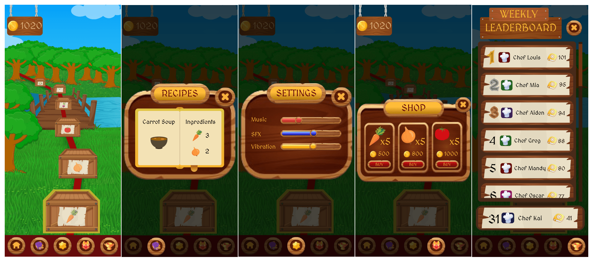
The level select screen is a central hub for players, allowing easy navigation through different aspects of the game. The recipe book enables players to view their unlocked recipes, the settings menu allows them to adjust game settings without having to navigate backwards, and the shop section features ingredients available for purchase. The shop layout highlights the top three most popular ingredients, making it easy for players to quickly find what they need. The leaderboard feature allows players to compete with others and see their ranking. The player’s board is prominently displayed at the bottom of the screen, allowing them to see how they compare to other players.
The level select screen is a central hub for players, allowing easy navigation through different aspects of the game. The recipe book enables players to view their unlocked recipes, the settings menu allows them to adjust game settings without having to navigate backwards, and the shop section features ingredients available for purchase. The shop layout highlights the top three most popular ingredients, making it easy for players to quickly find what they need. The leaderboard feature allows players to compete with others and see their ranking. The player’s board is prominently displayed at the bottom of the screen, allowing them to see how they compare to other players.
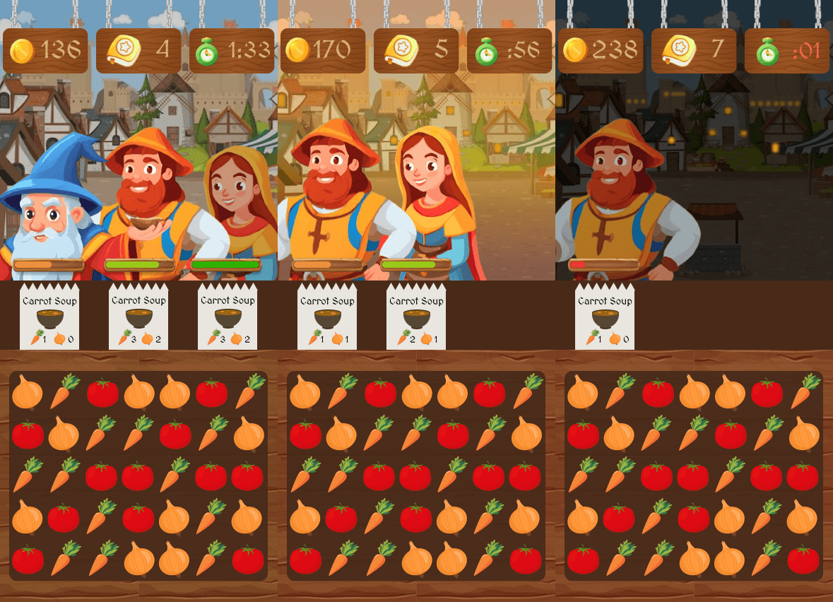
These are my designs for the main game screens. I divided the screen into three main sections: the gameboard, the orders, and the customers. The gameboard section is the largest, occupying most of the screen to give players a clear view of the game. The orders section is placed on top of this for ease of reference, allowing players to see what ingredients they need to collect quickly. The customers have progress bars that decrease and change colour, providing players with a visual representation of their progress and the urgency of fulfilling orders. As the game progresses, the time of day will also change visually, helping players easily monitor the remaining time. This is also displayed on one of three boards at the top of the screen, along with the player's coins earned and orders completed. These boards provide important information at a glance, helping players stay organised and focused on completing orders efficiently.
These are my designs for the main game screens. I divided the screen into three main sections: the gameboard, the orders, and the customers. The gameboard section is the largest, occupying most of the screen to give players a clear view of the game. The orders section is placed on top of this for ease of reference, allowing players to see what ingredients they need to collect quickly. The customers have progress bars that decrease and change colour, providing players with a visual representation of their progress and the urgency of fulfilling orders. As the game progresses, the time of day will also change visually, helping players easily monitor the remaining time. This is also displayed on one of three boards at the top of the screen, along with the player's coins earned and orders completed. These boards provide important information at a glance, helping players stay organised and focused on completing orders efficiently.

The screens that appear after a player wins or loses provide a sense of accomplishment and motivation to try again. The fail screen I designed features a tomato thrown at the screen, accompanied by a message explaining the reason for the loss. This adds a humorous touch to the game-over experience, making it more light-hearted and fitting with the medieval theme of the game. The victory screen offers players an overview of their achievements, with stars awarded based on their performance. This feedback encourages players to improve and strive for a higher score in future attempts. The number of orders completed and coins earned are also displayed, providing a tangible representation of the player's progress and success.
The screens that appear after a player wins or loses provide a sense of accomplishment and motivation to try again. The fail screen I designed features a tomato thrown at the screen, accompanied by a message explaining the reason for the loss. This adds a humorous touch to the game-over experience, making it more light-hearted and fitting with the medieval theme of the game. The victory screen offers players an overview of their achievements, with stars awarded based on their performance. This feedback encourages players to improve and strive for a higher score in future attempts. The number of orders completed and coins earned are also displayed, providing a tangible representation of the player's progress and success.